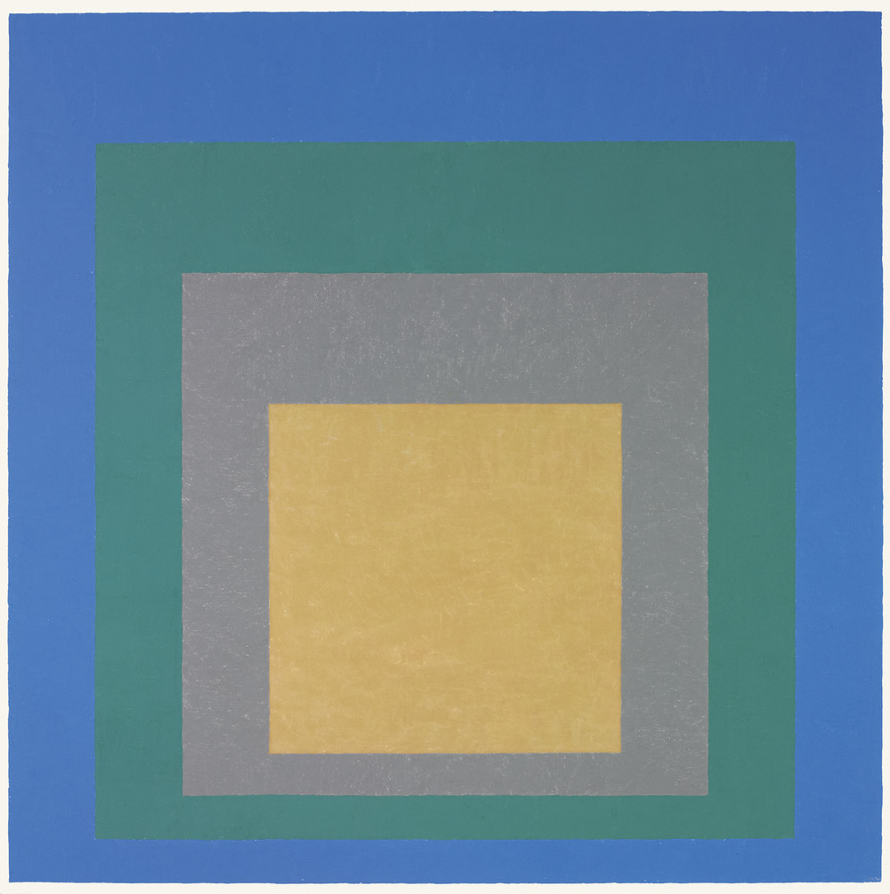
Josef Albers, Homage to the Square: Aurora, 1951-55
Grade:
High, University
Michael Murawski
Director of Education and Public Programs, Portland Art Museum, Oregon
Formerly Coordinator of Education and Public Programs, Mildred Lane Kemper Art Museum
In 1963 Josef Albers published his Interaction of Color, representing one of the few serious analytical attempts by a twentieth-century artist to revise and extend existing color theory.1 As stated in the publication’s introduction, it represents the artist’s articulation of “an experimental way of studying and of teaching color,” placing experiential practice before academic theory. Albers continues: “In visual perception a color is almost never seen as it really is—as it physically is. This fact makes color the most relative medium in art. In order to use color effectively it is necessary to recognize that color deceives continually.”2 The essential instability of color, which Albers described as “the discrepancy between the physical fact and the psychological effect” of a work of art, was repeatedly manifested in his seminal series Homage to the Square (1950–76). This series of abstract paintings and prints has often been seen as the culmination of Albers’s experimentation with color and light, a central focus throughout his career as an artist and teacher. In works such as Homage to the Square: Aurora and throughout the series, Albers negotiated the opposition between the physical materiality and subjective phenomena of color.
Albers painted more than one thousand Homage to the Square works during the last twenty-six years of his life, and many more were produced as lithographs and screen prints. Albers often used oil paint straight from the manufacturer’s tube, precisely applying thin coats with a palette knife to the rough side of a Masonite panel. He carefully recorded the technical details of each painting on the back of the panel, including the dimensions, the names of the paints used, and any varnishes or other materials applied to the surface of the painting. Through the self-imposed restriction of the square and his methodical articulation of color, Albers’s work moves against acknowledging the personal, expressive hand of the artist.
This tendency toward objectivity, however, is complicated by the paintings’ strong “psychic effect,” as Albers referred to it. For each arrangement of superimposed squares, the artist selected and positioned colors based on their interactions and “relationality.”3 In Aurora, the colors migrate across their borders; while they do not physically overlap in the painting, a slight unevenness at the edges heightens the ability of the colors to jump across these boundaries. Strong contrasts between hues—as well as alternating squares of light reflection and light absorption—draw our attention to the edges as “hot points” of activity.4 As contrasting hues interact, the color of an inner square jumps toward the outer boundary of the next square out, and vice versa. For instance, the yellow of the innermost square can be perceived along the outermost boundary of the gray square, and likewise with other color relations throughout the painting. Through this performance of color, combined with the slightly reflective surface of some of the alternating squares, the luminescent colors seem to glow and emit their own light. The vertical asymmetry in the composition also suggests movement among the colored squares, with the blue square receding and the yellow square projecting forward in a telescopic manner.
As the viewer enters into a dialogue with Albers’s Homage paintings, these color interactions exceed the material form of the artwork. “Painting is color acting,” Albers wrote. “The act is to change character and behavior, mood and tempo.”5 The Homage paintings engage the viewer’s process and understanding of visual perception, presenting ambivalent forms that demand from the viewer different decisions. Albers noted, “Some spectators are led to notice their preferred color or colors first. Others begin with ‘firsts’ in quality (i.e., high intensities in light and hue) or ‘firsts’ in quantity, measured either by extension or recurrence. . . . When it comes to reading advancing and receding color, there will rarely be agreement—regardless of convincing decisions offered by theories based on color temperature or wave length.”6
A major source of inspiration for Albers’s treatment of color as subjective phenomena was Goethe’s 1810 Farbenlehre (Study of color), adapted at the Bauhaus (where Albers was both a student and a teacher) through Johannes Itten’s own teaching and experiments with color.7 Of particular interested to Albers was Goethe’s examination of the phenomenon known as “simultaneous contrast”—the tendency of colors to shift based on their adjacent surroundings. Albers capitalized on the human response to these color relationships, evoking philosophical, expressive, or emotional reactions to color.8 In later works in the Homage series, he used closely related hues of the same color, requiring a more extended period of contemplation from the viewer.
Albers certainly placed an emphasis on the autonomy of color and its pure perception in the eyes of the spectator. As described by Achim Borchardt-Hume, the Homage series “annihilates anything beyond itself” and “exists only in the here and now of visual experience.”99 Yet at the same time Albers also directed the material facts of the painting to preface and advance a particular subjective response, and the artist himself became an active player in this game of artistic activity. In Aurora, the notes on the back of the panel record Albers’s path in creating this painting, including his mixing of some paint colors, layering of paint and varnish, and later overpainting with additional color and varnish.10 While these notes are not available to the viewer, his elaborate and instrumental process acts to govern the range of effects that can be culled from this particular painting.
Furthermore, Albers assigned his own descriptive subtitles for many of the works in this series after they were completed. In addition to Aurora, subtitles such as Apparition, Kind Regards, New Hope, and Tranquil suggest and reinforce certain transcendental or meditative responses in the viewer. Aurora references the Roman goddess of the dawn and generates associations with the warm glow of a morning sunrise. Homage to the Square: Aurora is a prime example of an Homage that achieves an unexpected spiritual or mythological ambiguity. Yet for other works Albers provided subtitles such as Saturated, Saturated II, R III-a 6, and R I c-i, countering the transcendental associations these paintings evoke with an emphasis on the formal “facts” of color and manufacturer’s codes. This constant flux between the objective and subjective characteristics of color defines the core of Albers’s project to translate the instability of color into artistic form.
Through his Homage series Albers established an unresolved dialogue between the material facts of the painting (nested squares, oil paint, manufactured colors) and its expressive subjectivity—between “the physical fact” and “the psychic effect.” On our initial perception of these works, we create the conditions for an exchange in much the same way that we return a serve in a game of tennis (to borrow a metaphor from Nicolas Bourriaud).11 The perceptual exercises in Albers’s series experiment with and complicate the relationship between artist, artwork, and audience, drawing attention to this relationality within the reduced format of strict geometry and color.
- 1 Achim Borchardt-Hume, “Two Bauhaus Histories,” in Albers and Moholy- Nagy: From the Bauhaus to the New World, ed. Achim Borchardt-Hume (New Haven, CT: Yale University Press, 2006), 71.
- 2 Josef Albers, Interaction of Color, rev. ed. (New Haven, CT: Yale University Press, 2006), 1.
- 3 Hal Foster, “The Bauhaus Idea in America,” in Borchardt-Hume, Albers and Moholy-Nagy, 99. In this essay Foster claims that this “attention to ‘relationality’ is key to both Albers’s practice and his pedagogy; it might well qualify as his version of the Bauhaus idea.”
- 4 Margit Rowell, “On Albers’ Color,” Artforum 10 (January 1972): 26.
- 5 Josef Albers, in Josef Albers: Formulation Articulation (London: Thames & Hudson, 2006), portfolio II: 29.
- 6 Ibid., portfolio I: 5.
- 7 Itten is assumed to have taught color in the basic course from 1919 to 1923, and then Paul Klee and Wassily Kandinsky taught color after Itten’s departure in 1923. Both Itten and Kandinsky examined the various effects of color through exercises using the square-in-square format, which Albers adopted in his color courses in the United States. Color appears to have been dropped from the basic course entirely after the Bauhaus moved to Dessau in 1925. See John Gage, “Color in Western Art: An Issue?,” Art Bulletin 72 (December 1990): 518–41. For more on Albers’s color courses, see Frederick A. Horowitz and Brenda Danilowitz, Josef Albers: To Open Eyes; The Bauhaus, Black Mountain, and Yale (London: Phaidon, 2006).
- 8 See Nicholas Fox Weber, “The Artist as Alchemist,” in Josef Albers: A Retrospective (New York: Solomon R. Guggenheim Museum and Abrams, 1988).
- 9 Borchardt-Hume, “Two Bauhaus Histories,” 78.
- 10 In addition to Albers’s notes written in black ink on the back of the panel during and at the end of its production (1951–55), there are also some notes written in pencil on the right side dated “Oct. ’58.” These notes provide the details of some overpainting that occurred to the yellow and green squares over the course of three years after the painting’s “completion” in 1955.
- 11 Nicolas Bourriaud, Relational Aesthetics, trans. Simon Pleasance and Fronza Woods (Dijon, France: Presses du Réel, 2002), 23.