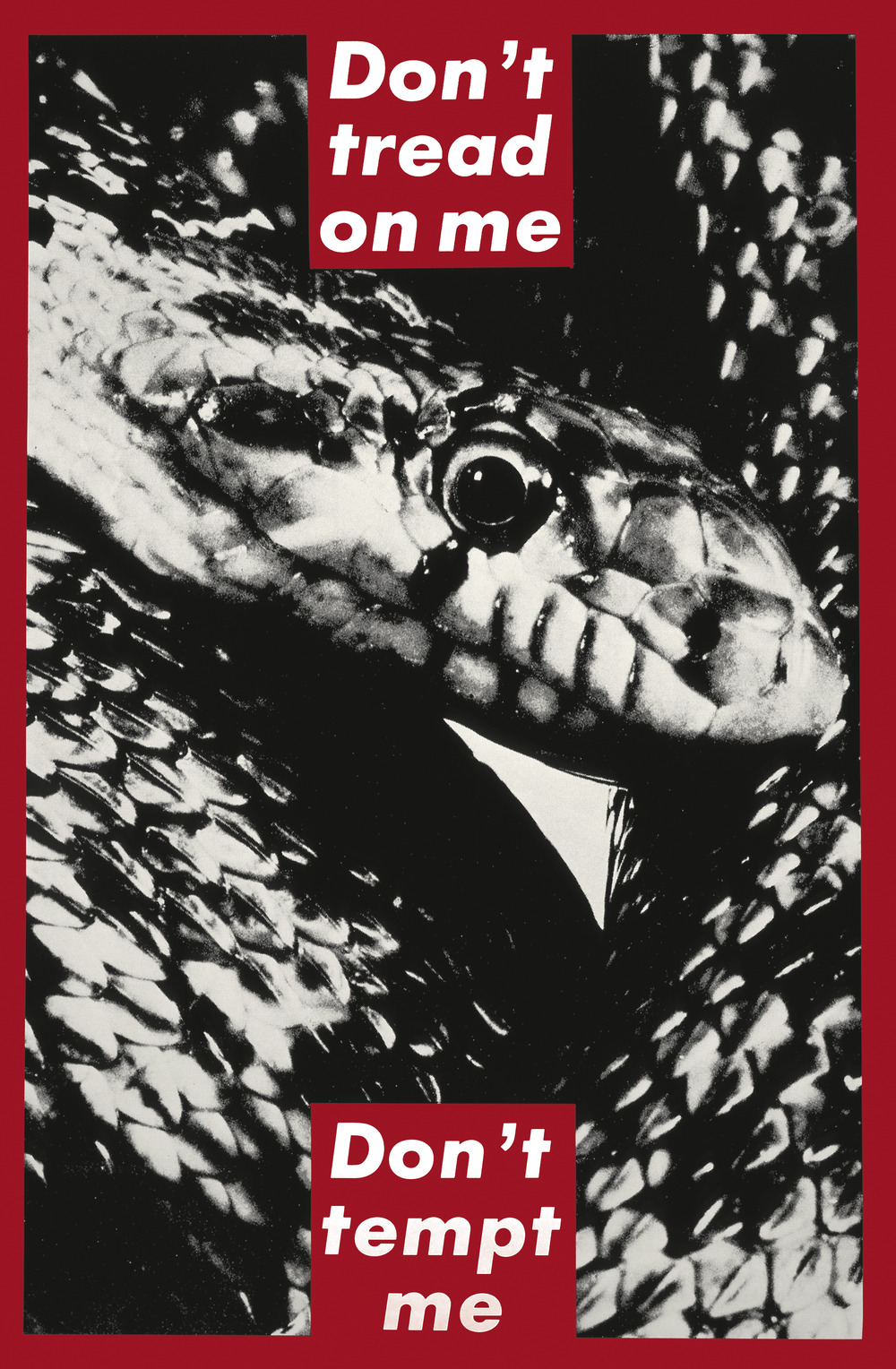
Barbara Kruger, Untitled, 1989–90
Bradley Bailey, November 2010
Bradley Bailey
Associate Professor of Art History, Saint Louis University
Barbara Kruger’s untitled screen print of 1989–90 is a prime example of her immediately recognizable aesthetic, in which familiar yet oblique phrases are set against an appropriated, generally black-and-white photograph. In the print she presents a closely cropped photograph of the head and surrounding torso of a coiled snake. A bold red border frames the image, which is flanked above and below by two red text boxes, each containing a phrase printed in white in the typeface with which she has become inextricably associated, the eminently legible Futura Bold Oblique, a simple, highly geometric sans serif design that is commonly used in advertising.1 According to Kruger, she uses the aesthetic of advertising design specifically as a “device to get people to look at the picture, and then to displace the conventional meaning that that image usually carried with perhaps a number of different readings.”2 Kruger juxtaposed stock and editorial photographs taken from advertisements with brief, generally suggestive texts (“I shop therefore I am,” “make my day,” “your body is a battleground”), pitting polarities against each other (contemporary / classic, high / low, personal / political) in ways that create new commentaries through their myriad levels of association. The box above the snake’s head contains the phrase “don’t tread on me,” while the text in the box at the bottom reads “don’t tempt me.” In spite of the latter plea (or threat), it is indeed tempting to locate the link that binds the three main elements that would provide the content or meaning of the work. Kruger’s methodology, however, resists such a traditional approach to reading and interpreting visual culture.
At nearly twelve feet high, Kruger’s untitled screen print is reminiscent of the banners and billboards that have featured her work worldwide. In addition to appearing in traditional museum and gallery spaces, her art has been equally effective and arguably more complex when exhibited in customarily non-art spaces and contexts, such as on billboards, on the facades of public edifices, inside subway cars, and on common consumer goods such as T-shirts, coffee mugs, and matchbook covers. These are all venues where an unsuspecting public is generally less prepared to be confronted with messages that generate more questions than answers. Screen printing itself, a process through which an image is produced by forcing ink through a woven mesh screen, was used almost exclusively as a commercial medium before Andy Warhol popularized its use for fine art in the 1960s.3 And rather than printing on the more traditional canvas, Kruger chose vinyl, a durable plastic support that, like screen printing, is better known for its commercial applications and is regularly used for large-scale outdoor signage.
The materials used in Kruger’s print exemplify Marshall McLuhan’s adage that “the medium is the message,” by which he suggests that the content of the message cannot be interpreted independently of the medium through which that content is circulated.4 Indeed, her signature aesthetic reflects McLuhan’s concept on multiple levels, as it acknowledges that both materials and language are part of larger systems of signification that are subject to interpretation and deconstruction. In a sense, the artist’s work is a confluence of two radically different vectors of meaning: advertising, which seeks to persuade and sell, and art, which seeks to provoke thought and generate discourse. Counted among the members of the generation of artists who emerged at the time of the highly influential exhibition Pictures in New York in 1977, Kruger started to establish her aesthetic in the early 1980s.5 Influenced by Jean Baudrillard’s philosophy regarding mass media consumption and the simulacrum, as well as Jacques Derrida’s concern with deferred meaning and the deconstruction of text, she began to explore an aesthetic that sought to question not only the nature of originality—a foundational aspect of modernism—but also the underlying structures of power that seek to control language and its meaning.6
The dislocation stemming from the simultaneous cohesion and detachment of image and text in Kruger’s untitled print is carried over into the experience of the viewer, whose traditional role in processing art is to find the relationship between the image(s) and text(s) that will provide meaning. The stern warning “don’t tread on me” is tempered dramatically by the more vulnerable, perhaps even seductive tone of the plea “don’t tempt me” below, resulting in a dichotomy of meaning that is mediated by the central image. Read in association with the snake, the phrase “don’t tempt me” conjures numerous Judeo-Christian themes, from the temptation of Eve by the serpent in the Garden of Eden, to a line from the Lord’s Prayer, “lead us not into temptation.”
This dichotomy of strength versus vulnerability is of particular interest to second-generation feminists like Kruger, whose work explores how the power structures that inform language are gendered. For example, her (1987) demonstrates how clichéd gender roles and stereotypes are dictated and reinforced through the media by superimposing the phrase “we don’t need another hero” onto an image resembling a Norman Rockwell illustration for the cover of the Saturday Evening Post, which shows a young girl cooing over a little boy’s effort to flex his bicep. Such works not only remind the viewer that the very systems of signification that Kruger uses cannot be understood outside the prevailing power structure but also reveal the irony that her textual commentary cannot exist outside the larger sociocultural discourse in which she must by necessity participate. Critical to this fluid, negotiable, and polysemous signification is Kruger’s characteristic use of pronouns such as you / your and, in the case of the Kemper Art Museum’s untitled print of 1989–90, me / my, which not only creates a polarity or protagonist / antagonist relationship within the narrative but also decenters viewers’ position within the narrative in accordance with their perceived sociocultural frameworks. The privileging of the subjectivity of “little narratives” over the modernist master narrative—wherein experience is universally meaningful, timeless, and seeks to establish “truth”—is central to her dialogue with viewers.7
Dominating the composition of Kruger’s untitled print is the image of the snake, one of the most potent signifiers in ancient and modern cultures throughout the world. The phrase “Don’t tread on me” immediately recalls the use of the rattlesnake as a familiar symbol of the American colonies in the eighteenth century, and it was used liberally on flags and standards during the American Revolution. The most famous of these—the Gadsden flag, named for its designer, General Christopher Gadsden of South Carolina—has been in use since it was instituted as a naval ensign in 1775 and has in recent years been more commonly identified with the United States Marine Corps.8 Though many variations exist, the most common version shows a coiled rattlesnake with thirteen rattles at the tip of its tail, representative of the original thirteen colonies. The snake in the photograph appropriated by Kruger is not a rattlesnake, however, but rather a bull snake or pine snake, a species that is also exclusively found in the Americas. It is perhaps of some significance that the bull snake, while not poisonous, carefully mimics the defensive behavior of the rattlesnake, coiling its body in a striking position and vigorously vibrating its rattleless tail in manner highly reminiscent of its venomous brethren.9 The bull snake’s clever simulation of its considerably more dangerous relative as a form of defense is perhaps analogous to Kruger’s similar use of appropriated texts and photographs, which comprise individual signifying elements that are not of her own invention but, as in the case of this print, combine to convey a powerful and provocative statement of caution.
In contrast to the brash confidence of the colonial revolutionary, invoked by “Don’t tread on me,” the phrase, “Don’t tempt me” casts the work’s “voice” in a considerably more complicated light, introducing the possibility of vulnerability or seduction, as the snake is potentially transformed from a symbol of liberty against tyranny into the very face of evil itself and a cold reminder of the human capacity for frailty and sin.10 Of course as Kruger has appropriated these popular phrases herself, one cannot ignore the aggregated meanings compounded by the appropriations of others. We cannot, for example, deny the potential significance of the fact that both phrases have been appropriated by gay activists. The Gadsden flag was adopted by thousands of gay rights marchers at the Democratic National Convention in San Francisco in July 1984,11 and the Lord’s Prayer by the lesbian social activist Rita Mae Brown, whose slightly altered and often-repeated version states, “Lead me not into temptation; I can find the way myself.” The Grammy-nominated British singer and songwriter Richard Thompson also used the phrase in the title of his song “Don’t Tempt Me” from his 1988 album Amnesia, in which he invokes the phrase “snakes alive,” a variation on “saints alive” or “sakes alive,” generally used as a more wholesome substitute for the expression “for the Lord’s sake.”
Indeed, depending on the viewer’s level of investment, a rigorous analysis of Kruger’s untitled print can lead to labyrinthine depths of meaning that function much like a spider’s web: the more intensively you struggle, the more treacherously you become entangled. As the artist herself has noted, “I would rather say that I work circularly, that is around certain ideational bases, motifs and representations. To fix myself, by declaring a single methodology or recipe, would really undermine a production that prefers to play around with answers, assumptions and categorizations.”12 Indeed, in Kruger’s work the fictional and the factual, as well as the personal and political, collide and collude in ways that reveal ever greater potential for meaning—meanings that result not only from the artist’s intention but also from multifarious, seemingly unlimited intersections with society and culture at large.
- 1 Kruger developed a facility with the language and visual structure of advertising while working as a graphic designer for several different publications at Condé Nast, where she eventually became art director for Mademoiselle. There are several excellent books and exhibition catalogs that exhaustively detail her background, chief among which are Kate Linker, Love for Sale: The Words and Pictures of Barbara Kruger (New York: Abrams, 1990); Ann Goldstein, ed., Barbara Kruger (Los Angeles: Museum of Contemporary Art; Cambridge, MA: MIT Press, 1999); and Alexander Alberro et al., Barbara Kruger (New York: Rizzoli, 2010).
- 2 Kruger, in Jeanne Siegel, “Barbara Kruger: Pictures and Words” (interview), in Art Talk: The Early 1980s (New York: Da Capo, 1988), 303 (originally published in Arts Magazine 61 [June 1987]: 17–21).
- 3 When the photographic image is transferred to a photochemically sensitive emulsion applied to the screen, the resulting negative image functions as a stencil, with the ink able to pass through only the permeable areas of the screen.
- 4 McLuhan’s often-cited phrase was first introduced in his book Understanding Media: The Extensions of Man (New York: McGraw-Hill, 1964).
- 5 While Kruger was not included in the Pictures exhibition, which art critic Douglas Crimp organized in 1977 for Artists Space in New York (where Kruger was also showing her work in the 1970s), her work is closely associated with the postmodern approach of the artists who were, among them Troy Brauntuch, Jack Goldstein, Sherrie Levine, Robert Longo, and Philip Smith. Kruger joins Cindy Sherman, Richard Prince, Jenny Holzer, and Laurie Anderson, among others, whose conceptual cross-media explorations of the late 1970s and 1980s have come to exemplify this aesthetic. Crimp’s essay “Pictures,” which extended his commentary beyond the scope of the exhibition, was published in October 8 (Spring 1979): 76–88. For more on this subject, see the recently published exhibition catalog by Douglas Eklund, The Pictures Generation, 1974–1984 (New York: Metropolitan Museum of Art; New Haven, CT: Yale University Press, 2009).
- 6 See Jean Baudrillard, “The Precession of the Simulacra,” trans. Paul Foss and Paul Patton, Art and Text 11 (September 1983): 3–47, and Jacques Derrida, “Structure, Sign, and Play in the Discourse of the Human Sciences,” in Writing and Difference, trans. Alan Bass (Chicago: University of Chicago Press, 1978), 278–93. Kruger’s work also calls on Walter Benjamin’s theories regarding the influence of mechanical reproduction on the creative process and Michel Foucault’s understanding of power and sexuality as powerful factors in defining discourse. See Walter Benjamin, “The Work of Art in the Age of Mechanical Reproduction,” in Illuminations, ed. Hannah Arendt, trans. Harry Zohn (New York: Schocken, 1969), 219–26, and Michel Foucault, The Archaeology of Knowledge, trans. A. M. Sheridan Smith (New York: Routledge, 2002).
- 7 This distinction was first defined by Jean-François Lyotard in The Postmodern Condition: A Report on Knowledge, trans. Geoff Bennington and Brian Massumi (Minneapolis: University of Minnesota Press, 1984).
- 8 The origin of the snake as an American symbol can likely be traced back to Benjamin Franklin’s 1754 woodcut of a snake separated into eight sections (the head represented New England), accompanied by the caption “join, or die,” which reappeared in November 1774 in the Massachusetts Sun newspaper with the same caption. Shortly after, the version popularized by Gadsden came to represent a wide variety of colonial regiments in the Carolinas, Pennsylvania, Virginia, and elsewhere. For more on the origins of the Gadsden flag and the rattlesnake as an American symbol, see William Rea Furlong and Byron McCandless, So Proudly We Hail: The History of the United States Flag (Washington, DC.: Smithsonian Institution Press, 1981), 71–77; Edward W. Richardson, Standards and Colors of the American Revolution (Philadelphia: University of Pennsylvania Press and the Pennsylvania Society of Sons of the Revolution and Its Color Guard, 1982); and Michael Corcoran, For Which It Stands: An Anecdotal Biography of the American Flag (New York: Simon & Schuster, 2002).
- 9 I thank Robert D. Aldridge, herpetologist in the Department of Biology at Saint Louis University, for identifying the animal as a bull snake. The description of the bull snake’s behavior was found in Carl H. Ernst and Roger W. Barbour, Snakes of Eastern North America (Fairfax, VA: George Mason University Press, 1989), 102.
- 10 This is not the first instance in which Kruger used a theme from Genesis in her work. Her Untitled (You Invest in the Divinity of the Masterpiece) of 1982 superimposes the phrase over the Creation of Adam scene from Michelangelo’s ceiling frescoes in the Sistine Chapel. Here, the “you” being chastised in the statement can be a male spectator or anyone complicit in the maintenance of what she perceives as the patriarchal systems of art-making, art history, and art criticism.
- 11 See Robert L. Loeffelbein, The United States Flagbook: Everything About Old Glory (Jefferson, NC: McFarland, 1996), 147.
- 12 Kruger, in Siegel, “Barbara Kruger,” 304.